
App Configuration - the NExS.app Worksheet
Overview
NExS apps are generated from a spreadsheet uploaded in the .xlsx file format (Office Open XML). This is the native format for Excel spreadsheets, and is supported by most other spreadsheet editors, such as Google Sheets and Apache Open Office. When a spreadsheet file is uploaded, the NExS platform automatically extracts all the cell formatting information, as well as the cell formulas that drive the spreadsheet calculations. NExS needs a bit more information to configure your app. At a minimum, NExS needs to know:
What you want to name your app.
How your app is to be deployed and who has access to it.
Which blocks of cells you want to be included in the app. These are called views.
Which cells within those views you want to be editable; i.e., serve as inputs to your app.
When a spreadsheet is uploaded, the processing software looks for a worksheet named NExS.app which contains all the information needed to create an app from your spreadsheet.
A minimal NExS.app worksheet looks like this:
| A | B | C | |
|---|---|---|---|
| 1 | app | My App | |
| 2 | view | Sheet1!a1:g18 | |
| 3 | editable | b1:b5, c17 |
This specifies that your app will be an open mode app named "My App" with a single view. The view will consist of the range A1:G10 on worksheet "Sheet1", and cells in the range B1:B5 and C17 will be editable.
Section definitions (app and view) always start in column A. The app definition section must come first. There can be as many view definitions as you want, but there must always be at least one. As you can see, each section consists of a list of key/value pairs entered in columns B and C.
The “app” configuration section
The configuration options that appear in the “app” section of the NExS.app worksheet are as follows:
Mode. The deployment mode of the app. The available modes are:
Open. This is the default mode. An open mode app can be accessed by anyone with the URL. Each time an open mode app is accessed (i.e., opened in a browser window) a new, unique instance is created. The lifetime of the instance is until the browser window is closed or reloaded.
Personal. A personal mode app requires the user to login to the NExS platform. Each user has a personal copy of the app. Unlike an open mode app, the data entered in editable cells persists permanently, or until the app is deleted by its owner.
Team. A team mode app is similar to a personal mode app in that login is required and data is persistent. The difference is that with team mode everyone shares the same instance of the app.
Access Code. An access code app supports collaborative access to a single instance of the app. It is similar to the team mode above, but doesn't require the collaborators to have a NExS account. Instead, an access code is required to access the app. If multiple users login to an access code app, edits made by one user are seen by all. The lifetime of the app is permanent; i.e., data entered in editable cells persists permanently, or until the app is deleted by its owner. Access code apps allow you to control access to individual views based on the codes. This allows for the creation of powerful collaborative apps with data privacy. Access codes are specified explicitly in NExS.app as described below.
Access Codes. The access codes attribute precedes a list of access key/code pairs, applicable only for access code apps. This can be thought of as passwords, but work slightly differently. When an access code app is invoked, the user is prompted for an access code, which must be in this list. The example which follows shows a list with two access codes. The first is “foo” for User1, and then “bar” for User2.
| A | B | C | D | |
|---|---|---|---|---|
| 1 | app | My App | ||
| 2 | mode | access code | ||
| 3 | access codes | |||
| 4 | User1 | foo | ||
| 5 | User2 | bar |
AccessList. The accessList is a comma-separated list of NExS userIDs (email addresses) which are allowed to access a team mode app. Each of the email addresses must be associated with a NExS account.
AllowedOrigins. This setting allows you to control which hosts are allowed to serve embedded NExS apps. By default, you can embed a NExS app on any web page on any domain. With the allowedOrigins setting, you can control which servers or domains are allowed to host your app. For example, suppose your company’s domain is “mycompany.com” and you want to allow your app to be embedded on any web page within the “mycompany.com” domain you would specify allowedOrigins as *.mycompany.com. The format of the allowedOrigins setting is a comma-separated list of allowed origins. Examples:
*.mycompany.com allows the app to be embedded on any page within the mycompany.com domain.
www.mycompany.com would allow the app to be embedded only on the server named www.mycompany.com.
*.mycompany.com, *.myothercompany.com would allow the app to be embedded on any page within either domain.
https://*.mycompany.com would allow the app to be embedded only on secure pages within the mycompany.com domain.
NoViewNav. The noViewNav attribute specifies that the app should not include a view navigation menu for apps with multiple views. This can be useful if you wish to build your own view navigation control using the NExS Embedded API.
Submit List. The submitList option allows you to specify a comma-separated list of email addresses to which submitted data will be sent when the sendData action is triggered.
Chart Options. The chartOptions attribute introduces a list of global chart styling options. The sub-attributes are key/value pairs in columns C and D, just like the access codes list above. All of the chart options can be overridden for an individual chart (see the Chart definition section below). The chart options are:
Palette. The palette option specifies the color scheme for charts. It is a comma-separated list of color names or RGB colors encoded as hexadecimal values and prefixed with a hashtag symbol; i.e., #rrggbb.
FontSize. The fontSize option specifies the font size to use for the X and Y axes of charts. The accepted values are small, medium (the default), and large.
HighlightColor. The highlightColor option may be used to specify the color used to highlight a section of the X axis on a chart. (See Highlight in the chart configuration section.) The default value is #ffffe0 (light yellow).
BackgroundColor. The background color for the entire chart area, specified as a color name or #rrggbb. The default background is transparent.
AlternateColor. If specified, alternating bands of the Y axis will be this color.
TextColor. The color of the chart titles, axis labels, tick marks, and legend items. The default is black.
GradientFill. If specified, area charts will be displayed with a gradient fill below the line.
Markers. A comma-separated list of marker symbols. The default is “circle, square, diamond, triangle, and triangle-down. You may specify any order and subset of those symbols.
MarkerSize. An integer value to specify the marker size. The default is 4. A value of 0 means no marker.
LineWidth. An integer value to specify the width of the connecting line between the markers. The default is 2. A value of 0 means no connecting line.
Slider Options. The sliderOptions attribute introduces a list of global slider options. The slider options are:
Color. The color of the slider handle, expressed as #rrggbb. The default value is #337ab7 (steel blue).
Shape. The shape of the slider handle. The accepted values are round (the default), square, or triangle.
Led Options. The ledOptions attribute introduces a list of global LED options. The LED options are:
Size. The size of the LED status light. The accepted values are large, medium (the default), and small.
Cell Locks. Cell locks provide a powerful mechanism to share information across all instances of an open mode app. Cell locks may be atomically set via a built-in API. Their functions are explained in detail in the section on button action methods. Cell locks are defined as a comma-separated list of ranges. The example below allocates 20 cell locks in the range Sheet2!A1:B10.
| A | B | C | D | |
|---|---|---|---|---|
| 1 | app | My App | ||
| 2 | cell locks | Sheet2!A1:B10 |
The “view” configuration section
Following the end of the app configuration, you must specify at least one view. Views define the user interface for your app; i.e., how the user sees and interacts with your app on a web page. Think of a view as a “tab” on your spreadsheet. Just as it is useful to organize a large, complex spreadsheet using multiple tabs, it is similarly useful to organize a complex NExS app using multiple views to improve the user experience. This can be particularly important when designing an app to be used on mobile devices with limited screen real estate.
A view may be any rectangular range of cells within your spreadsheet. That may be an entire worksheet (i.e., spreadsheet tab), or any block of cells within the worksheet. (Cells outside of the view will never be seen by your user, which makes them convenient to use for things like scratchpad calculations, etc.) For example, the view declaration below sets the range A1:G18 on Sheet1 as the block of cells that the user will see.
| A | B | |
|---|---|---|
| 1 | app | My App |
| 2 | view | Sheet1!a1:g18 |
If the view declaration specifies a worksheet name but not a block of cells, then the entire worksheet will be included in the view. If the worksheet name is omitted, the first worksheet in the workbook will be assumed. Additionally, the view range may be specified as a named range. For example, if the range Sheet1!a1:g18 is named "MyView", then the declaration below is equal to the one above:
| A | B | |
|---|---|---|
| 1 | app | My App |
| 2 | view | MyView |
The view configuration options are as follows:
Name. A descriptive name for the view. For apps with multiple views, the name will appear in the view selection menu. If not specified, the view name will default to “View 1” for the first view, “View 2” for the second view, etc.
Background Color. If specified, sets the view background color. It may be specified as a color name, a #rrggbb value, or a reference to a cell within the view from whose background color will set the background for the entire view. This option is useful for eliminating the “ghost” lines which appear between the cells on some browsers. The default view background is transparent.
Public. A public view is a special view associated with a team mode or access code app. Public views do not require a login or access code to be viewed. This allows public access to selected views of a private app. For example, consider a competition scoring app where the judges securely login to update scores, and a public view allows anyone to view the latest scores in real time.
Editable. A comma-separated list of cells or ranges of cells that the user is allowed to edit when using the app. For example, specifying Editable as “A1, B2:B7” means that the user may edit the values in cells A1, B2, B3, … B7. Editable cells must be within the view range.
Input or Inputs. A synonym for “Editable”. This is provided for convenience and readability of the app specification when it is more convenient to think of an editable cell as an input to the app. Further, it is possible to specify the inputs / editable cells on separate lines in NExS.app to create logical groupings. For example, the two following specifications are equivalent (highlighted for emphasis)::
| A | B | C | |
|---|---|---|---|
| 1 | app | My App | |
| 2 | view | Sheet1!a1:g18 | |
| 3 | editable | b1:b5, c17 |
Is equivalent to:
| A | B | C | D | |
|---|---|---|---|---|
| 1 | app | My App | ||
| 2 | view | Sheet1!a1:g18 | ||
| 3 | inputs | b1:b5 | # cash flows | |
| 4 | input | c17 | # start date |
This example also illustrates the use of comments. Comments can be inserted as desired for documenting the app specification. Comments begin with either “#” or “//”. Also, note that color coding and text formatting are not relevant to the NExS.app specification, but can be used for emphasis or to improve readability.
Input Attributes
Input attributes may be specified in a comma-separated list in the column following the cell list. The available input attributes are:
Required. The required attribute is used in conjunction with the %REQUIRED macro (see the section on Button Macros below). The %REQUIRED macro evaluates to 0 when all required inputs on the view have been set to non-blank values, and is generally used to control the "disabled" button property.
Email. The email attribute on an input cell means that only a value in the correct form of an email address will be accepted.
Phone. The phone attribute on an input cell means that only a value in the correct form a phone number will be accepted.
Checkbox. A checkBox is a special type of input (as described above). A checkBox will display as checked if the value is 1 and unchecked if the value is 0. Clicking the checkBox will toggle the value between 0 and 1, as intuitively expected. Like inputs above, checkBoxes are specified as a comma-separated list of cells or ranges.
RadioGroup. A radioGroup is also a special type of input. A comma-separated list of cells or ranges defines a group of radio buttons, similar to checkBoxes above. Clicking on a radio button will set it's value to 1, and simultaneously set the value of all other radio buttons in the group to 0, as expected.
AccessKeys. For "access code" apps, the accessKeys setting specifies which users are allowed access to the view. The setting is a comma-separated list of access keys that are allowed to access and interact with the view. In the following example, User1 is allowed access to View 1, and User2 is allowed access to View 2:
| A | B | C | D | |
|---|---|---|---|---|
| 1 | app | My App | ||
| 2 | mode | access code | ||
| 3 | access codes | |||
| 4 | User1 | foo | ||
| 5 | User2 | bar | ||
| 6 | view | Sheet1!a1:g18 | ||
| 7 | access keys | User1 | ||
| 8 | inputs | b1:b5 | # cash flows | |
| 9 | input | c17 | # start date | |
| 10 | view | Sheet2!c1:g5 | ||
| 11 | access keys | User2 |
ReadAccess, ReadAccessList or ReadACL. The readAccess setting is a comma-separated list of user ID’s for a team-mode app. Any user on the list who is logged in to the NExS platform has access to see this view. It is similar in concept to the access keys setting described above with two fundamental differences:
The access keys setting is used exclusively with access code mode apps, while the readAccess setting is used exclusively with team-mode apps.
The readAccess setting gives the specified users the right to see the view, but not to interact with any editable cells. That requires writeAccess permission (see below). Access code mode apps do not support separate read/write access permissions.
WriteAccess, WriteAccessList or WriteACL. Similar to the above, the writeAccess setting is a comma-separated list of user ID’s for a team mode app. With writeAccess, a user may both see the view and interact with any editable cells within the view.
SubmitButton or Submit. (This feature is deprecated. Please consider using a Button with the "sendData" action instead.) This submitButton setting designates a special cell to contain a “submit” button. The “submit” button is used with NExS apps designed to be used as smart forms. When the “submit” button is clicked, the values of all editable cells within the app are submitted to the NExS server and stored in a database. The submitted data is available to the app owner from the app management console. The value of the underlying cell is used to enable or disable the button. For example, suppose that cells A1:A4 are input cells and B2
Chart. This keyword introduces a chart definition. In a NExS app, charts overlay a block of cells within a view. The chart definition specifies where the chart appears within the view, the type of chart, and the range of cells that serve as the source of the data for the chart, plus a few additional options such as the chart type, additional information to display, etc. The example below is a minimal NExS.app specification for an app to include a chart:
| A | B | C | D | |
|---|---|---|---|---|
| 1 | app | My App | ||
| 2 | view | Sheet1!a1:g18 | ||
| 3 | chart | a1:e7 | ||
| 4 | source | Sheet2!a1:d5 |
In this example, a chart generated from the data located in Sheet2!a1:d5 will overlay the range a1:e7 of the view.
The elements of the chart definition are as follows:
Source. A range reference to the block of cells containing the data that is to be displayed on the chart. Note that the source data may come from anywhere within the entire spreadsheet, and does not have to be part of the view. The format of the source data is illustrated by the following example, contained in Sheet1!a1:d5.
| A | B | C | D | |
|---|---|---|---|---|
| 1 | Chart Title [y-axis label] | |||
| 2 | x-axis label | Category 1 | Category 2 | Category 3 |
| 3 | Data point 1 | 1.2 | 3.2 | 6.3 |
| 4 | Data point 2 | 5.1 | 1.5 | 8.32 |
| 5 | Data point 3 | 8 | 2.7 | 9.01 |
The source range is the minimum specification for any chart. The following is a complete example to display a column chart from the source data above in cells a1:d5 of the view:
The first cell of the source data contains the chart title to be displayed, optionally followed by a label for the y-axis in square brackets. Either or both may be omitted if desired by leaving, in this case, cell A1 blank.
The first cell in the second row specifies the x-axis label (which may be blank if desired). Subsequent cells in the second row specify category labels.
The third and following rows specify the data points to be displayed.
The chart source data specified above will produce the chart below displayed within the range a1:e7 of the specified view:

For pie charts (see Type below), the interpretation of the source data is different. The x-axis and y-axis labels are not used, and the third and following rows contain [slice name, value] pairs. Any remaining data is ignored. To help visualize this, if the chart type were set to “pie”, the source data above would produce the following:

Note that any of the elements in the chart source data may be specified with formulas and will dynamically update accordingly.
Type. The chart type. Currently supported chart types are:
Column (default)
Bar
Line
Area
Pie
Stacked Column
Stacked Bar
Stacked Line
Stacked Area
Legend (see LinkTo option)
Sort. The sort option causes charts to dynamically re-order the X-axis categories such that data appears in sorted order. The keyword sort is followed by a single parameter, ascending or descending. The chart data will be displayed accordingly. For stacked charts, the sort is based on the total of the stacked data. If a particular element of the stacked data is removed by clicking the corresponding legend item, the chart will be automatically re-sorted as expected.
Show. The show option causes additional data to be displayed on a stacked chart. The show keyword is followed by a comma-separated list of items to show. Currently, the two items are total, which displays the total value for each X-axis category in a stacked chart, and percent, which displays the percent of the total for each element of a stacked chart when hovering over the element.
Orientation. This option is for convenience in formatting the source data to indicate the layout of the data in the table. If orientation is set to “row”, each row after the second specifies a data point. If set to “column”, each row after the second is a category. In other words, the categories and data points are transposed. The default orientation for line, bar, and column charts is “row”, while the default for pie charts is “column”. The source data layout below illustrates “column” orientation.
| A | B | C | D | |
|---|---|---|---|---|
| 1 | Chart Title [y-axis label] | |||
| 2 | x-axis label | Data point 1 | Data point 2 | Data point 3 |
| 3 | Category 1 | 1.2 | 5.1 | 8 |
| 4 | Category 2 | 3.2 | 1.5 | 2.7 |
| 5 | Category 3 | 6.3 | 8.32 | 9.01 |
YMin. The minimum value for the Y axis. If not specified, the value is set automatically based on the data.
YMax. The maximum value for the Y axis. If not specified, the value is set automatically based on the data.
LinkTo. This option provides a user experience enhancement when two related charts are displayed within the same view. Linked charts must share the same categories. Currently, there are two supported linkages:
Clicking on slices of pie charts will cause the corresponding data sets of a linked chart to be highlighted.
Clicking on items of a “legend” chart will highlight the associated data series of any linked chart. This effectively allows two related charts to share a single legend.
Highlight. This option allows a cell value to be linked to the X axis value of a chart, allowing the X axis value to be visually highlighted based on the cell value. If the cell’s value matches an X axis label, that section of the axis will be highlighted (i.e., background shaded). Highlight only applies to chart types which display an X axis.
Chart Styling options
The following options allow for styling of individual charts and override the global chart options.
Palette. The palette option specifies the color scheme for charts. It is a comma-separated list of color names or RGB colors encoded as hexadecimal values and prefixed with a hashtag symbol; i.e., #rrggbb. Colors will repeat if there are more categories than colors.
FontSize. The fontSize option specifies the font size to use for the X and Y axes of charts. The accepted values are small, medium (the default), and large.
HighlightColor. The highlightColor option may be used to specify the color used to highlight a section of the X axis on a chart. (See Highlight in the chart configuration section.) The default value is #ffffe0 (light yellow).
BackgroundColor. The background color for the entire chart area, specified as a color name or #rrggbb. The default background is transparent.
AlternateColor. If specified, alternating bands of the Y axis will be this color.
TextColor. The color of the chart titles, axis labels, tick marks, and legend items. The default is black.
GradientFill. If specified, area charts will be displayed with a gradient fill below the line.
Markers. A comma-separated list of marker symbols. The default is “circle, square, diamond, triangle, and triangle-down. You may specify any order and subset of those symbols. If there are more categories than marker symbols, the symbols will repeat.
MarkerSize. An integer value to specify the marker size. The default is 4. A value of 0 means no marker.
LineWidth. An integer value to specify the width of the connecting line between the markers. The default is 2. A value of 0 means no connecting line.LineWidth. This option controls the thickness of the connecting lines on line charts. If lineWidth is set to 0, no line is drawn between data points.
Legend. This option controls how category legends are displayed. If legend is set to “none”, “off”, or “hide”, no legend is displayed. Other options are “top”, “bottom”, “left” and “right”. The default is “bottom”. Optionally, the keyword “reversed” can be included to reverse the order in which the categories are displayed in the legend. For example, specifying “right, reversed” will display the legend on the right side of the chart with the categories displayed in reverse order.
Slider. This keyword introduces a slider definition. Sliders are a user interface enhancement for inputting numerical data. The slider is linked to an editable cell. When the user interacts with the slider to change its value, the new value is sent to the linked cell. The slider options are as follows:
Cell. The cell in which to place the slider.
LinkedCell. The editable cell to which the slider is linked.
Minimum. The minimum slider value (default 0).
Maximum. The maximum slider value (default 10).
Step or Increment. The incremental step value for the slider (default 1).
Color. The color of the slider handle in the hexadecimal form #rrggbb. Defaults to the value specified in the sliderOptions setting in the app definition section.
Shape. The shape of the slider handle. Options are round, square, or triangle. Defaults to the value specified in the sliderOptions setting in the app definition section.
LED. This keyword introduces an LED status light definition. LED status lights are a user interface enhancement for visual status displays. When an LED status light is placed in a cell, it appears as a colored LED light. The color is defined by the text contents of the cell. The available colors are red, green, yellow and blue. Any other value in the cell displays the LED in the “off” state, as illustrated in the example below.
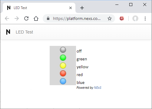
The LED status light options are as follows:
Cell. The cell in which to place the LED.
Size. The LED size. Options are large, medium, and small. Defaults to the value specified in the ledOptions setting in the app definition section.
Button (or Buttons). A comma-separated list of cells or ranges of cells that will serve as buttons to trigger an action. Buttons are a user interface enhancement that turn the contents of a cell into a clickable button. Clicking a button triggers a “nexsbuttonclick” event in the NExS Embedded API. Via the API, buttons may be connected to any valid javascript code. (This is conceptually similar to buttons in Excel which are used to invoke VBA functions.) Buttons may also trigger built-in actions, such as setting the value of input cells, or switching between views. Built-in actions are a very powerful feature to add functionality to your app without any programming.
Button cells may contain plain text, numbers, or formulas (just like a normal cell). By default, buttons inherit the appearance of the cell (i.e, colors, font style, and font weight). While this is sufficient for many applications, it is sometimes useful to have more control over the button’s properties. NExS provides this capability by allowing you to append a button control object enclosed in curly braces to the contents of the cell. The object’s properties then override the default properties of the button. This is best understood by example. Setting the cell’s value to Hello!{fg: 'red', fontWeight: 'bold'} will cause the button to display “Hello!”, overriding the default foreground color and font weight properties. Using a formula to generate the object string allows the button properties to dynamically control the button properties. For example, setting the cell’s contents to
="Hello!{fg: '" & B8 & "', bg: '" & B9 & "'}"
allows the button’s foreground color to be controlled by cell B8 and the background color to be controlled by cell B9.
The available button properties are:
bg. The button’s background color.
fg. The button’s foreground (text) color.
fontWeight: The font weight (“normal” or “bold”).
fontStyle: The font style (“normal” or “italic”).
disabled: If set to true, the button will be disabled and will not respond to clicks.
hidden: If set to true, the button will not be displayed at all within the cell.
extra: A user-defined property that allows an arbitrary value to be passed to the nexsbuttonclick event handler. It is set to null by default.
Built-in actions are triggered by special button methods. The action methods are:
alert. The alert action displays a modal dialog with a message. For example,
{alert: 'Congratulations, your data was submitted successfully!'}
Optionally, one can specify an alert "type" to give a cue as to its significance:
{alert: {type: 'fail', message: 'Sorry, your data was not submitted!'}}
The alert types are "success" (the default), "info", "warning" and "fail".
confirm. The confirm action displays a modal dialog prompting the user to confirm a pending action. Similar to alert, the confirm action has a "message" property and optional "type" property, but also has an "ok" action and a "cancel" action:
{confirm: {prompt: 'Are you sure you want to submit this form?', ok: {sendData: …}, cancel: {setView: 'CanceledView'}}
sendData. The sendData action will send an email to a specified recipient or recipients containing a specified range of data. For example, the button specification Submit {sendData: 'a1:c5'} would submit the contents of the range A1:B5 on the current view to the recipient(s) via an email. The recipients are specified by the submitList option in the app configuration section. If submitList is not specified, the email is sent to the app owner. ( The sendData action is intended to replace the deprecated SubmitButton feature previously described.)
getCellLock. Cell locks are designated ranges of cells that are persistent and shared across all instances of an open mode app. When the app is first created, cell locks are set to 0 and any reference to the cell within a spreadsheet formula will return the value 0. When the lock is set, the cell will return the value 1. The getCellLock action will attempt to atomically set a temporary cell lock which expires after 15 minutes. If successful, the lock will be "owned" by the app instance until it expires. As a simple example, the button specification Lock {getCellLock: 'Sheet2!a1'} will attempt to lock the cell Sheet2!a1. The lock will succeed if the cell is not currently locked by another app instance. In a practical application, however, we would want the button action to be conditional on the success or failure of the lock attempt. To accomplish this, getCellLock provides for "success" and "fail" actions. For example,
Lock {getCellLock: {cell: 'Sheet2!a1', success: {setView: 'SuccessView'}, fail: {setView: 'FailView'}}}
will switch to a different view depending on the success or failure of the lock attempt. In a typical use case, one would set the "disabled" property of the button if the lock was already set by another instance. For example,
="Lock {getCellLock: {cell: 'Sheet2!a1', success: {setView: 'SuccessView'}, fail: {setView: 'FailView'}} disabled: "&Sheet2!a1&"}"
confirmCellLock. The confirmCellLock action is similar to getCellLock, but with important distinctions:
Whereas getCellLock locks the cell for a limited period of time, confirmCellLock can either permanently lock the cell, or set a specific time for the lock to expire.
An app instance must already "own" the cell lock via getCellLock before it can successfully execute confirmCellLock.
The app owner may lock a cell via confirmCellLock regardless of its current lock state or ownership.
The best way to understand getCellLock and confirmCellLock is to consider a typical use case. Suppose we wish to build a time slot scheduling app whereby users can exclusively request a particular schedule slot. The user's initial view would be a list of schedule slots. Each slot would be represented by a button and associated with a unique cell lock. The cell lock would reflect whether or not the slot has been taken. Buttons for slots which have been taken would be set to the "disabled" state based on the value of the cell lock. When a user clicks on a desired schedule slot, the action would 1) get a temporary lock via getCellLock, and if successful, 2) redirect to a view (e.g. named "ScheduleRequest") containing an information form to be submitted via the sendData action. The user would then "own" the slot for the next 15 minutes while filling out the form. When the form is completed, the user would click a "Submit" button which would 1) send the form data to the app owner via sendData, and 2) permanently set the lock via confirmCellLock. The reason for the 2-step process is to avoid a situation where a user starts the process of filling out the form and never completes it. Since the initial lock is temporary, the lock will be automatically released after 15 minutes in that case.
releaseCellLock. The releaseCellLock action releases a cell lock. The lock can only be released by the instance which set it, or by the app owner. A typical use case in the context of the example above would be a "Cancel" button on the "ScheduleRequest" view that would release the lock redirect back to the initial view.
releaseAllCellLocks. The releaseAllCellLocks action is available only to the app owner, and provides a convenient way to reset all cell locks in the app to the zero state.
setInputs. The setInputs action sets the value of one or more input cells when the button is clicked. The property value is an array of range, value pairs enclosed in square brackets. For example, suppose your app has a form with three input cells A1, A2, and A3. You would like to give the user a button to clear the form by setting all three cells to blanks. This can be accomplished by creating a button cell with the contents Clear {setInputs: ['a1', '', 'a2', '', 'a3', '']}, or more concisely as simply Clear {setInputs: ['a1:a3','']}. By default, the cell addresses reference input cells within the current view. To set an input on another view, prefix the cell address with the view name followed by an exclamation point; e.g., "View2!a2". (If the view name contains spaces, you must enclose it in single quotes; e.g., "'View 2'!a2".)
setView. The setView action will switch the app display to the specified view. The property value is the name of the view to display. For example, suppose you are creating a multi-page smart form, where the pages are defined by views named View 1, View 2, … You could place a “Next” button at the bottom of View 1 to switch the user to the next page (View 2). This would be accomplished by setting the contents of the button to Next {setView: 'View 2'}.
Remember that a button’s contents can be a formula, which allows dynamic control of the button action. For example, suppose you are creating a smart form which responds differently for different age groups. Building upon the “Next” button example above, you may have a special view for senior citizens. Assume your app has an input cell named “Age” where the user has entered their age. The Next button could be programmed to take users above age 62 to a different view using a formula like this:
="Next {setView: '" & IF(Age>62, "Senior View", "View 2") & "'}"
Multiple button actions may be combined in useful ways. For example, a "Submit" button with the following contents will submit the contents of the form in range A1:C5, clear all inputs in A1:C5, and redirect the user to a "Thank You" screen:
Submit {sendData: 'a1:c5', setInputs: ['a1:c5', ''], setView: 'Thank You View'}
Note that editable cells should generally not be converted into buttons, as they will no longer be editable.
Button Macros
Button macros are provided as a convenience in defining button actions. When the button's action is evaluated, any macro will be replaced by its value. The available macros are:
%CELL
The %CELL macro represents the address of the cell containing the button. In other words if a button is located in cell A2, any occurence of %CELL in the button action will be replaced with "A2".
%REQUIRED
The %REQUIRED macro is designed to be used with the "required" attribute of inputs and the "disabled" property of the button. If a view contains one or more required inputs, a "Submit" button with its "disabled" property set to %REQUIRED will stay disabled until all required inputs have been filled in. Example: Submit {disabled: %REQUIRED, sendData: …}